Sunday, 23 October 2016

Sunrise at Fleet Pond

On a freezing cold day back in January, I had an appointment at the dentist to have a filling replaced.  Knowing how quickly the station car park fills up, I drove up early and parked my car then found myself with half an hour to kill before I went for my appointment.  Those of you who know Fleet will be aware that the station is right next to Fleet Pond, a nature reserve that has featured previously in this blog.  It was an icy day and the pond was completely frozen over so I decided to spend my time watching the sun rise.  It was a beautiful morning which was inevitably going to end up in a painting one day.  It took a couple of months for me to come back to it.  This is often the case as I mull the picture over in my head, trying to work out what I want from the end result.  In this case it was the blues and pinks of the sky that stayed in my mind so that's what I set out to capture. I used a watercolour under-painting, followed by pastels - a technique you'll have seen me use once or twice before.  


Having finished this picture, I took a bit of a break from painting over the summer, I focusing instead on landscaping the garden. Those of you who also paint will know that after a break, it's sometimes hard to get back into things and when I returned to my easel I was at a bit of a loss as to where to begin.  I've stopped parking my car at the station now (the cost is ridiculous) and instead use my parents' driveway which is a 10 minute walk away round, you guessed it, Fleet Pond.  So now I get these fabulous sunrises every single day of the week.  It seemed an obvious place to start - pick up again where I left off.  The next few paintings ended up in the bin.  I couldn't seem to get what was in my head out onto the paper and I screwed them up in frustration.  This afternoon I decided to just spend some time playing around with a few sketches which was exactly what I needed to do.  This is one of them - another sunrise using Pan Pastels.  Pan Pastels are pastel pigment compressed into a dish and you apply them using either your fingers or sponges.  I opted for sponges this time, something I haven't really tried before but will definitely be doing again.  I stopped myself from adding too much detail on the reed banks, choosing instead to just hint at them with the green.  I love the end product and as it was supposed to just be an experiment it has come as a bit of a surprise.  Now I'm left wondering what I can do next with these lovely little pots of colour but for now I'll leave you with today's efforts.

Saturday, 16 January 2016

Fall Foliage

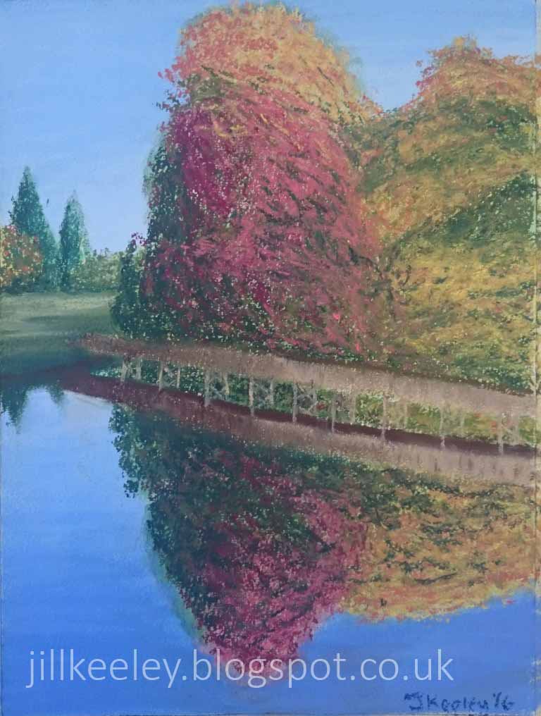
Every now and then an email drops into my inbox from Pete Marney, a former colleague and an excellent photographer.  His emails contain links to his latest set of photographs along with stories and anecdotes describing where and why they were taken.  It always makes a nice start to my day when they turn up and I spend a little while browsing through his pictures with my morning cuppa before getting on with my work.  His mails were one of the inspirations behind this blog as I wanted to find my own way of telling the stories behind my pictures so it follows that sooner or later I was going to use one of his pictures as inspiration too.  

Back in October I got a message titled "Fall Foliage" with a set of photographs taken on a weekend trip to somewhere called Skytop Lodge.  I'm not entirely sure where Skytop lodge is (the email didn't say) but it looks like a lovely place so, with Pete's permission, I decided to have a go at my own interpretation of those beautiful autumn leaves.  I used pastels to get the bright colours on a watercolour under painting.  It's one of those paintings that was hard to judge when it was time to stop.   I could probably have kept going for longer, adding to the trees but I'm not sure I'd have improved it by doing that so it's coming off the easel as soon as I've finished writing this.  


If you like this one than please go ahead and check out the original photo on Pete's website.  Unusually for me, I tried to stick pretty closely to the original photo this time.  I hope I've done it justice.

Sunday, 6 December 2015

New York


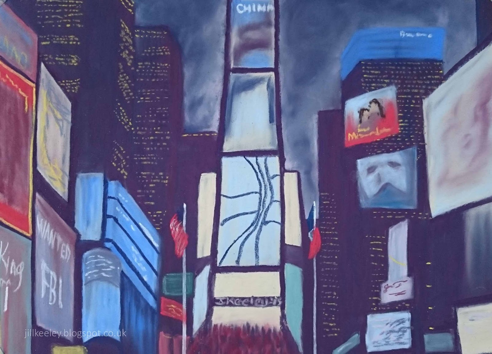
Whether you love it or hate it, there's no denying that New York can be a bit of an assault on the senses.  Times Square, in particular, is noisy and chaotic.  There's an interesting array of smells, some nicer than others and it's impossible to walk from one side of the square to the other without bumping into hundreds of people and photo bombing many more.

I have to admit that after a week I'm usually quite pleased to return to the relative quiet of home - even with a hotel room on the 27th floor I could hear the car horns at night.  That doesn't in any way take away from the fact that it's an incredible city to visit.  I have a feeling that one painting of Times Square is only the tip of the iceberg when it comes to finding inspiration here.  It's such an iconic place that we're so use to seeing on TV and in movies and the first time you visit you get a strange sense of deja vu.

I've been twice this year, both times for work (you can see our office in this picture).  After my first visit in June, I wanted to do a painting that captured the vibrant nature of the place but I wasn't quite sure how to approach it.  Then I read an article in a magazine which showed a painting of a night scene in Bangkok and how it was built up.  I decided that this was the way to represent New York so on my next visit I went out after work one evening and took some photos to work from.  Pastels seemed the obvious choice to get those bold colours and once I got going, this picture actually progressed pretty quickly. The whole thing was done in an afternoon and I made very few finishing touches when I came back the next week to look at it.

Saturday, 14 November 2015

Sacre Coeur


This picture is from my last visit to Paris.  Happy memories with wonderful friends who I am lucky enough to be seeing this evening.  Like most of us, I was shocked and saddened when I picked up my newspaper this morning and heard of the devastating attack on this beautiful city.  It's beyond comprehension how anyone could dream up such a plan, let alone carry it out.

As you get on with your lives and prepare for your Saturday evening in with your family or out with your friends, spare a thought for the people who will never be coming home and the friends and families waiting for them.

Sunday, 1 November 2015

Chicago Bean

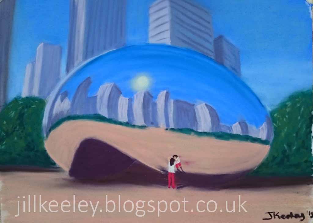
I went to Chicago earlier this year to visit some friends.  After a week in noisy, hectic New York, I was expecting more of the same as I stepped off the plane.  I couldn't have been more wrong.  Chicago is a much more relaxed, chilled out city.  And very arty too.  There's all kinds of interesting sculptures and artworks dotted around the place making it a lovely city to spend a few days exploring.  Without a doubt, Anish Kapoor's Bean (or Cloud Gate) in Millenium Park is the most striking and probably most photographed work of art that I saw during my stay.  The bean is perfectly smooth and polished and was built about 10 years ago following a design competition.  I would imagine there is a considerable cleaning effort required to keep it looking as flawless as it does.


It's not the easiest of things to paint either as the shape distorts everything in the reflection.  I put off  starting this picture for quite a while as I mulled over how to tackle it.  In the end, I dug out my pastels again as I thought they'd be a fun way of making the curved shapes and smooth surfaces and I think it was the right decision.

When I was there it was a beautiful sunny day and the place was swarming in tourists all taking pictures on their phones.  I couldn't help thinking it would look a lot better if we weren't all there so I decided to leave all but one of the people out of my final painting. This lady, leaning against the bean looking at her distorted reflection, hall of mirrors style is the only one who made the cut.  I liked her because she was just enjoying the moment instead of snapping away on her camera phone like the rest of us.  We should all take a leaf out of her book.  We miss so much with the all too easy point, click and move on approach that so many of us take to exploring a new place.

Sunday, 16 November 2014

The Figure in Dance

In a bid to add a bit of variety to my paintings and move on from the usual landscapes, I've been to a number of portrait and life drawing classes over the last year.  I've spent many an evening sat in front of a model trying to get their limbs and features in the right place which is not as easy as it sounds.  The nature of these classes has meant I've come away with very few finished pieces to share with you but I have learned a lot.

When I joined Farnham Art Society and read through the program of events, "the Figure in Dance" caught my eye and I put my name down for this workshop with Jamel Akib.  We worked from photographs with a focus on bringing movement into the picture, something I don't do at all with a life model for obvious reasons.  After a couple of warm up sketches we moved onto our first picture.  The aim here was to use the background to help introduce that movement before we had even started on the figure herself.  As my other teachers will tell you, backgrounds are often a bit of an afterthought.  I may add a chair leg to stop my model from floating in mid air but I rarely give it much more thought than that so this was a very useful exercise.  The background here is done using acrylics with the figure then added in pastel.

In the afternoon, some of my fellow artists moved onto pictures of birds in flight with some amazing results.  I was enjoying the dancers though so decided to stick with that theme. I love the shapes that they make and I was particularly taken by the photo of these two where the lighting made it hard to tell where the dancer ends and the background starts.  I decided to give it a shot for my second painting.  I used acrylic and pastel again.  I didn't manage to finish this one during the workshop but took it home and continued working on it.  I'm pleased with the end result as both pictures are quite different from anything I've done before.  I think the first one is my favourite.  I came away from the workshop with hundreds of ideas so watch this space.  I would like to say a big thank you to Jamel and to Farnham Art Society for organising a thoroughly enjoyable day.

Sunday, 5 October 2014

Battersea Power Station

This one was a special request from a friend at work.  He wanted Battersea Power Station looking "industrial and derelict with a hint of a future to come".  I've got to admit, I didn't quite know where to begin so I started by reading a bit about the history of this London landmark.  When the power station was first proposed in the late 1920s, the idea provoked protests from Londoners who felt it would be an eyesore and who worried about the effects of pollution.  In an attempt to address some of these concerns, Sir Giles Gilbert Scott was commissioned to design the exterior of the building.  This is the same guy who also designed the red telephone boxes we all know and love so he clearly had a talent for producing iconic designs.  I think the tactic worked because at some point in the last 85 years, we fell in love with the place.  Where once people protested at the idea of it being built, now they protest at the idea it could be pulled down and developers wanted to make use of the site are forced to invest millions of pounds in its restoration.

Having learnt a bit more about the place and completed a few sketches in the process, I started on a drawing.  I thought this view with the railway line in front of it could help add to the industrial feel of the finished picture and the scaffolding would give a hint of future redevelopment.  It works to a certain extent but I don't think it really conveys the sheer scale of the place.  This is an enormous Power Station.  It's Europe's biggest brick building and it dwarfs everything around it and somehow that's not quite happening here.

So for my final painting, I chose a view from the other side of the building.  Here we're looking up instead of across and there is no real foreground to distract us.  The blocks of flats in the background are big ugly buildings in their own right but they look almost insignificant next to the power station.  I used watercolours and pastels because I felt that with watercolours alone, I couldn't quite get the industrial look I was aiming for.  There was a point about 3/4 of the way through the painting where I wasn't at all happy with it and I started drawing out a new version, bringing the building forward and towards the middle of the page.  It wasn't quite right there though and when I looked back an hour or so later at the first version, I could see where my mistakes were.   They were mostly around the horizon so I went back to correct them and the building sits a bit better in it's surroundings now.  I'm pretty happy with the end result - let's hope my colleague is too.